


This manual sets out the guidelines for using the R.M. Manfredi logo in all its variants. The logo is a key part of the company's visual identity and must be used consistently and correctly in every application.
The logo download section also lets you download the logo in SVG, PNG or WebP format and customise it using the available options.
Logo
The R.M. Manfredi logo has an original, extended version that includes the full company name in the same style. The two elements must not be separated or repositioned or resized in relation to each other.

Alongside this version, two variants are available for specific needs:

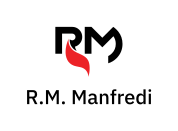
The compact version consists of only the “RM” portion of the extended logo, with no changes to the elements' position or proportions. It is used where space is limited or the logo needs to appear at a small size on a web page.
The vertical version places the wordmark below the compact mark. It can be used when the available space does not suit a horizontal layout. The distance between the two elements must be equal to x.
An extended version that includes the word “Antincendio” is also available when the company's area of activity needs to be specified. The standard extended version is always preferable.

To ensure visibility and recognition, including when logos appear alongside one another, the logo must have clear space on all four sides. This “clear space” must be at least x, where x is the height of the “R” in “RM”, as shown in the image.
Measure the clear space from the lowest edge of the logo in every direction, excluding the red portion of the standard-colour logo.

The clear space must be maintained in every use of the logo, in print and digital formats, to ensure the brand remains legible and recognisable.
When multiple logos appear together, maintain the clear space between them and centre the R.M. Manfredi logo vertically and/or horizontally in relation to the others.
Colours
The standard logo uses two colours: red and black. This is the preferred version and should be used wherever possible. A reversed version is also available for dark backgrounds, replacing black with white.
If a monochrome logo is needed, it may be used entirely in black or white.
0,0,0,0
255,255,255
FFFFFF
100,100,100,100
0,0,0
000000
0,100,100,0
237,28,36
ED1C24
Use the primary red to highlight text in print. For digital content, dark red is recommended to keep highlighted text accessible.
0,82,82,40
153,27,27
991B1B
Download the logo
The logo is available in the following colour combinations:




For combinations other than those shown here, please contact the graphic design team to check that the logo is being used correctly.
Customise the logo using the available options and download it in SVG, PNG or WebP format. The logos are scaled in proportion to one another, preserving the relative size of each variant and option at the same scale as the original file.
In versions with clear space, the logo is surrounded by a predefined margin to ensure legibility. These variants also let you choose a background colour from the options in this document.
The default options are the preferred choices and are recommended for most uses of the logo.
Download a logo
Fonts
The wordmark uses IBM Plex Sans Medium.
The IBM Plex family and its variants are used for all R.M. Manfredi® text:
- IBM Plex Sans for body text, headings and subheadings,
- IBM Plex Serif for secondary text and paragraphs,
- IBM Plex Mono for code and other monospaced text.
Use
The R.M. Manfredi logo is a registered trademark protected by copyright. Any use that does not comply with the guidelines in this document is prohibited. The logo must not be modified, altered or used in a way that could cause confusion with the R.M. Manfredi brand.
The logo must not be used in a way that suggests an association with another company, product or service.